Updates since 3.0
Initiatives
Combobox select all
Combobox includes a select property to display a "Select all" checkbox when the component has a selection of "multiple" or "ancestors". When toggled, the "Select all" checkbox will select or unselect it's child Combobox Items. When some, but not all Combobox Items are selected, the "Select all" checkbox will display in a mixed state.
<calcite-combobox label="Lord of the Rings characters" select-all-enabled>
<calcite-combobox-item value="bilbo-baggins" heading="Bilbo Baggins"></calcite-combobox-item>
<calcite-combobox-item value="frodo-baggins" heading="Frodo Baggins"></calcite-combobox-item>
<calcite-combobox-item value="gandalf" heading="Gandalf"></calcite-combobox-item>
</calcite-combobox>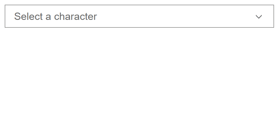
selectAllEnabled property offering the ability to toggle all of the child Combobox Items.
Input Time Picker masking
Input Time Picker now offers masking so users can adjust the component's value via keyboard.
The component's functionality has been enhanced to better accommodate keyboard users. The component will now open when interacting with the component's chevron via mouse.

Enhance component interactive states
Calcite continues its initiative to audit and update interactive states across the design system, focusing on providing consistent, accessible, and expected feedback for user interactions such as hover, press, and focus. These updates ensure that each component provides clear visual cues for all interactive states, improving usability and accessibility for all users.
This release brings enhanced interactive states to the following components:

Feature enhancements
- Resizing usability improvements
- Corner radius tokens
- Block and List Item expanded property
- Split Button href property
- Dialog prevent autofocus on open
- Action Bar floating property
- Text Area component tokens
Resizing usability improvements
Shell Panel now offers improved usability via its resizable property, making it easier to discover and resize Panels. Additionally, Panels can now be resized when display is "float", providing more flexibility with your layout and user experience.
Corner radius tokens
Calcite has updated its approach to corner radius tokens for improved clarity and flexibility. This change provides a more descriptive and scalable set of tokens for customizing component roundness. Update your styles to use the new tokens for future compatibility.
--calcite-corner-radius-sharp(0px) — Deprecated--calcite-corner-radius-round(4px) — Deprecated--calcite-corner-radius-none(0px) — Replacement--calcite-corner-radius-xs(2px) — New--calcite-corner-radius-sm(4px) — Replacement
#layer-button {
--calcite-button-corner-radius: var(--calcite-corner-radius-sm);
}

--calcite-corner-radius-sm token applied.
Block and List Item expanded property
The open property on Block and List Item components has been deprecated in favor of the new expanded property. This change improves clarity and consistency across components.
<calcite-block collapsible expanded heading="Layer effects" description="Adjust blur, highlight, and more"
icon-start="effects">
<calcite-action slot="control" text="Information" icon="information"></calcite-action>
<div slot="header-menu-actions">
<calcite-action text="Information" icon="information" text-enabled></calcite-action>
</div>
</calcite-block>Split Button href property
Split Button now supports setting an href on the primary button, allowing it to function as a link. This enables navigation to external URLs or routes directly from the primary action.
<calcite-split-button href="https://3mcbc.roads-uae.com" primary-text="Go to Esri">
<calcite-button slot="secondary">Secondary Action</calcite-button>
</calcite-split-button>Dialog prevent autofocus on open
Dialog now includes an option to prevent autofocus when the component opens by setting focus to { initial. This is useful for workflows where a user should maintain current focus or avoid interrupting screen readers.
const dialog = document.getElementById("example-dialog");
dialog.focusTrapOptions = { initialFocus: false };
initial set to false, which avoids moving focus into the component automatically.
Action Bar floating property
The new floating property for Action Bar now provides the same floating appearance and overflow menu behavior as Action Pad.
<calcite-action-bar floating>
<calcite-action icon="pencil" text="Edit"></calcite-action>
<calcite-action icon="trash" text="Delete"></calcite-action>
<calcite-action icon="copy" text="Copy"></calcite-action>
</calcite-action-bar>

floating property replaces Action Pad, offering the same floating style.
Text Area component tokens
Text Area introduces new component tokens for customizing corner radius, shadow, and footer background color.
#feedback-text-area {
--calcite-text-area-corner-radius: 8px;
--calcite-text-area-shadow: 15px 15px 8px rgba(0,0,0,0.08);
--calcite-text-area-footer-background-color: pink;
}

Accessibility and Internationalization
- Norwegian alias of
nntono - Localization improvements
- Switch's enhanced contrast
- Improved warning color contrast
- Enhanced placeholder text color contrast
Norwegian alias of nn to no
When specifying the Nynorsk locale ("nn" or "nn-NO"), it will now default to Norwegian string translations ("no") instead of English. This is similar to the existing behavior of other locales where there are no specified string translations, such as Spanish - United States ("es-US").
Learn more about Language and region fallback and how to supply your own string translations using the message property.
Localization improvements
Input Number now no longer accepts invalid characters when the lang is set to Chinese Simplified ("zh-CN"), providing more support across locales. Additionally, Input Date Picker displays the correct value for Arabic ("ar") locales.
Switch's enhanced contrast
Switch's contrast has been enhanced, exceeding the Web Content Accessibility Guidelines Success Criterion 1.4.1: Use of Color. The accessibility and usability improvements provide more color contrast to more audiences.

Improved warning color contrast
Components using the warning color now offer additional color contrast in both light and dark modes. The warning color displays in components where kind is "warning", and when Rating's average is specified. Components with contrast improvements include:

average color contrast has been enhanced for light and dark modes.
Enhanced placeholder text color contrast
Placeholder text color contrast has been enhanced exceeding the Web Content Accessibility Guidelines Success Criterion 1.4.3: Contrast (Minimum)'s radio of at least 4.5 to 1 for both light and dark modes across the following components:

Changes since 3.0
A full list of changes since 3.0 include:
Features
- accordion: Add new component tokens and deprecate old tokens (#11390) (fdf3e61)
- accordion-item: Enhance component's interactivity states (#11935) (46ddfd3)
- action: Enhance component's interactivity states (#11478) (aad98df)
- action-bar: Add floating property and "grid" layout value (#12103) (7cd7fd5)
- block, block-section: Add
expandedproperty and deprecateopenproperty (#11582) (999f532) - block-group, list: Add event for when a move is halted due to
canorPut canreturning false (#11567) (f080121)Pull - block: Add specific component css tokens (#12102) (ce22de4)
- block: Enhance component's interactivity states (#11827) (7d509c6)
- button: Enhance component's interactivity states (#12005) (55f2882)
- button: Enhance component's interactivity states (#11590) (23a62ca)
- chip: Deprecate
pressedin favor ofpress(#11389) (c905f9f) - chip: Enhance component's interactivity states (#11538) (8db5697)
- combobox, combobox-item-group: Add component tokens (#11623) (8215314)
- combobox: Add
selecttoggle property (#11721) (d084410)All - combobox-item: Add component tokens (#11645) (9cbd155)
- combobox-item: Update idle icons (#11801) (034f430)
- combobox-item: Update interactive state (#11647) (19d7c43)
- combobox-item: Update selection icons (#11726) (723fd22)
- dropdown, dropdown-item, dropdown-group: Add component tokens (#11465) (85f9378)
- dropdown: Add
offsetandDistance offsetproperties (#11614) (3381040)Skidding - dropdown-item: Enhance component's interactivity states (#11821) (14ed4a8)
- fab: Add component tokens (#11838) (d88d73b)
- fab: Enhance component's interactivity states (#12097) (8407e0a)
- fab: Add component tokens (#11723) (d436514)
- filter: Add component tokens (#11885) (b6516f8)
- flow-item: Expose
Flowtype (#11791) (28c7522)Item Like - input-message: Add component tokens and deprecate --calcite-input-message-spacing-value (#11759) (efddfaf)
- input-number: Add component tokens (#11961) (88dafa7)
- input-time-picker: Add separate hour, minute, second and meridiem input fields (#11712) (4fa4e20)
- list-item, list: Add
expandedproperty and deprecateopenproperty (#11003) (c80c44c) - list-item: Enhance component's interactivity states (#11824) (718f51d)
- meter: Add component tokens (#11757) (a8daa99)
- Move Tailwind preset to package (#11817) (6a37f65)
- notice: Add token for close icon and title text color (#11938) (4a3bbc1)
- rating: Enhance component's interactivity states (#11469) (11d83f6)
- radio-button-group: Add component tokens (#11897) (25f9b07)
- radio-button: Add component tokens (#11891) (c6141a7)
- segmented-control-item: Enhance component's interactivity states (#11477) (f025330)
- sheet: Add component tokens (#12023) (3d40a2f)
- shell-panel: Add component tokens (#11926) (e71ad98)
- shell-panel: Improve visibility of resizable functionality and allow resizable for all displayMode values (#11983) (a47a350)
- shell: Add component tokens (#11908) (e3443e9)
- split-button: Make downloadable and linkable (#11520) (fb3e1dc)
- stepper-item: Add component tokens (#12035) (5223751)
- stepper: Add component tokens (#12036) (b4531bb)
- Support
nnlocale (#12079) (202aaa6) - switch: Enhance component's colors for a11y and usability (#11951) (a878811)
- tab-title: Enhance component's interactivity states (#11493) (88a5260)
- tabs, tab-nav, tab-title, tab: Add component tokens (#11720) (e208b56)
- text-area: Add design tokens for corner radius, shadow, footer background color (#12124) (9f5d3ba)
- time-picker: Add component tokens (#11942) (a8fa5d0)
- tokens: Add transparency-inverse tokens (#11974) (db09167)
- tree, tree-items: Add component tokens (#11884) (a252522)
Bug fixes
- action-menu: Stop propagation of internal popover events (#12051) (269892f)
- autocomplete: Fix setFocus method in Safari (#12092) (34598c9)
- autocomplete: Should open on key input and close when key input is cleared (#12113) (c87b66d)
- card-group: Restore default gap spacing (#11638) (a554598)
- date-picker-month: Fix height of calendar to 6 rows (#12085) (80f7598)
- dialog, modal, sheet: Fix page scrolling after closing (#12006) (01ae74b)
- dialog, modal, sheet: Honor
initialwhen opening components (#12084) (125e294)Focus - dropdown-group: Fix error caused by early removal (#11612) (2dcef25)
- Fix memory leak caused when disconnecting floating-ui (#12107) (b4d79a6)
- input-date-picker: Add label property for screen readers and AT (#11995) (499414f)
- input-date-picker: Allow clearing invalid date value (#11937) (8d86681)
- input-date-picker: Ensure ar-fallback when the locale is ar-SA (#12025) (20d7ad9)
- input-number: Allow editing of numbers that start with zeros (#11705) (660ceed)
- input-number: Cancel arrow down event (#11956) (7883325)
- input-number: Ensure change event correctly fires for all locales (#11982) (c3862f6)
- input-number: Prevent entry of invalid characters (#12093) (37dbae7)
- input-time-picker: Invert text color on Windows when each masked input is focused (#12130) (92d59d1)
- input-time-picker: Isolate calciteTimeChange event listener to just the component instance it was fired from (#12109) (14ed37a)
- input, input-number, input-text, text-area, combobox: Pass AA for placeholder text color (#11972) (7f01b14)
- list-item: Align elements to the left of the item's content (#11977) (8a557d9)
- list-item: Display selection border when item is focused (#11898) (fd277f4)
- list, block-group: Fix drag handle events when lists or blocks are nested (#11816) (a1798ee)
- list, block-group: List nested in shadow DOM loses drop zone styling (#12105) (7470f5d)
- list: Correctly set the drag order and set size on filtered items (#12075) (7444251)
- list: Remove auto expanding behavior when dragging (#12121) (556d296)
- navigation: Add missing css display (#12076) (4b6e3dc)
- Outside click of a focus trap should not focus initial focused element (#11823) (bfe793a)
- panel: Apply custom styles correctly to header actions (#11495) (5e84892)
- panel: Fix
--calcite-panel-header-action-text-color-press(#12110) (2df071f) - Remove unused dragging styles (#11883) (#11889) (bbd6170)
- Set floating-ui elements max size set to the view (#11577) (b3ffd7f)
- shell-panel, sheet: Resize handle overlaps dropdown within panel (#12046) (3c955c0)
- shell-panel: Handle overflow scrolling (#12056) (68e1073)
- shell-panel: Handle overflow scrolling (#12069) (518a396)
- shell, sheet, dialog, modal: Fix for slotted component interaction (#12059) (5d3917f)
- sort-handle: Allow move and reorder events to be cancelled (#12095) (5f07b93)
- split-button: Fix duplicate border when
hrefis set (#11976) (4ea3b9c) - tab-nav: Emit
calciteevent only when selected tab changes (#11812) (0ad0097)Tab Change - tab: Fix focus outline placement on scrolling tabs (#11967) (9e77950)
- tabs: Redisplay close button when more than one tab is closable (#11492) (ae8064e)
- table-row: Update
selectedproperty oncalciteevent (#12015) (089df00)Tab Row Select - text-area: Fix error caused by internal measuring on disconnect (#11751) (810f79e)
- text-area: Height is no longer fixed when viewport resized to narrow dimensions (#11247) (28048ac)
- text-area: No longer changes height & width when status is invalid (#11826) (97dc878)
- tooltip: Close tooltip when hovering out of an iframe (#11600) (93a5692)
- tooltip: Do not open after the pointer has moved off of the reference element (#11599) (33cadc8)
Deprecations
- action-pad: Deprecate component in favor of action-bar with floating property (7cd7fd5)
- notice: Deprecate notice close text color tokens (4a3bbc1)
Compatibility
The 4.32 release of the ArcGIS Maps SDK for JavaScript supports Calcite version 3.0.3. In your application, we recommend using the same version or any minor version greater than ^3.0.3.
If you are using version 4.31 it is recommended to use Calcite's 2.13.0, or any minor version greater than ^2.13.0.